

When it comes to interior design, the use of monochromatic colours is a timeless strategy that continues to captivate homeowners and interior designers alike. The concept of sticking to a single colour palette, varying only in shades and tones, offers a range of benefits that extend beyond mere aesthetics. From creating a cohesive and harmonious atmosphere to accentuating architectural details, here’s a closer look at the advantages of embracing monochromatic colours in residential interior design.
What is Monochromatic?
A monochromatic colour scheme is a palette that revolves around a single base colour, with variations created by adjusting its saturation and brightness in other words utilising the tonal scale of a colour to achieve different hues of the same colour. This approach produces different shades and tones while maintaining harmony within the design. Black and white serve as the two extremes on the scale, providing contrast and depth to the chosen colour.
Timeless Sophistication and Versatility
Monochromatic colour schemes, often cantered around a single base hue, bring an inherent sense of sophistication to any space. From the serene ambiance of muted neutrals to the bold statement of deep, rich tones, the versatility within a single colour family allows for endless design possibilities. This timelessness ensures that the chosen palette won’t fall victim to fleeting trends, offering a sustainable and enduring elegance.
The beauty of monochromatic design lies in its adaptability to various Australian home styles. Whether it’s a contemporary apartment in Melbourne’s CBD, a coastal retreat in Queensland, or a heritage terrace in Sydney’s inner suburbs, the monochromatic approach seamlessly integrates with diverse architectural contexts. In Australian homes, where natural light is often abundant, monochromatic schemes can transform dramatically throughout the day, creating living spaces that feel dynamic and responsive to their environment.

Consider the impact of an all-white colour scheme in a sun-drenched Sydney beach house, the varying intensities of light create subtle shifts in tone throughout the day, from crisp brightness at midday to warm ivory as the sun sets.
However, in saying this being extremely careful when playing with an all-white colour scheme as this can come across blinding or give off the wrong vibes like for example clinical. Whilst I love to be bold and dramatic it ultimately depends on a client’s personal style and what they want to achieve in their space.

Accentuating Architectural Elements
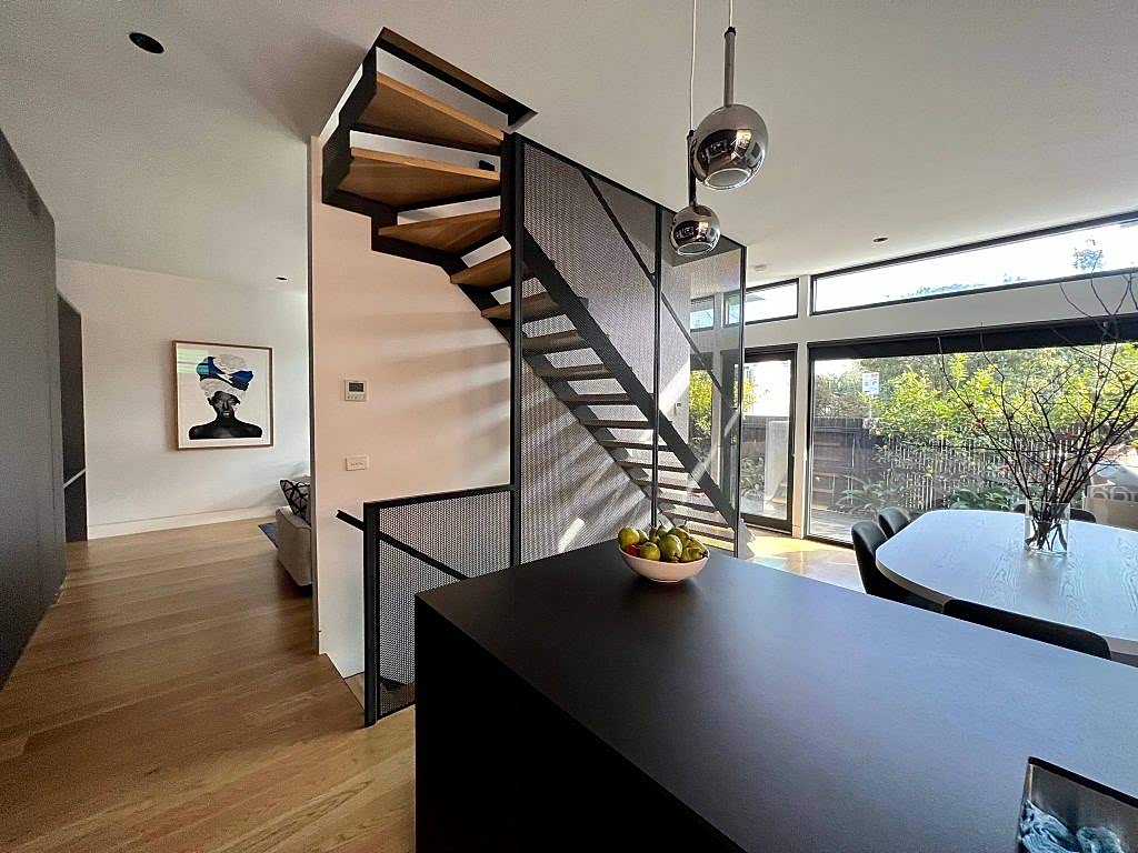
One of the key advantages of a monochromatic approach is its ability to emphasise architectural features within a home. By selecting a single colour and exploring its various shades, attention is drawn to structural elements, creating a cohesive and visually appealing backdrop. This technique becomes especially impactful in highlighting intricate mouldings, unique ceilings, or other distinctive features that might otherwise go unnoticed.

For example, in Australia’s diverse housing stock, from Federation-era homes with their ornate ceiling roses and cornices to mid- century modern properties with their clean lines and geometric features, monochromatic colour schemes serve as an elegant framework that celebrates architectural heritage. A palette of warm greys, for instance, can accentuate the charm of period details in a Victorian terrace, while a gradation of soft whites might highlight the sculptural qualities of contemporary architecture.
Often working with heritage-listed properties we find that monochromatic schemes respect the building’s historical integrity while allowing for modern interpretation. The subtle variations in tone create depth without competing with original features, establishing a thoughtful dialogue between past and present that resonates with Australian homeowners’ appreciation for architectural history.
Visual Harmony and Cohesion
Monochromatic colour schemes effortlessly instil a sense of visual harmony and cohesion throughout a home. The seamless flow from room to room creates a unified design language, promoting a feeling of continuity and balance. This approach is particularly effective in open-concept spaces, where a consistent colour palette ensures a connected and inviting atmosphere, making the home feel more expansive and harmonious.
Indoor to outdoor living is central to residential design, monochromatic schemes can elegantly bridge interior and exterior spaces. A thoughtfully selected palette that extends from living areas to alfresco dining spaces creates a sense of expansiveness that complements the whole space. This cohesion is especially valuable in smaller urban dwellings, where spatial continuity can make modest dimensions feel more generous.


I note that monochromatic schemes support the visual connection between spaces without requiring identical styling throughout. Each room can maintain its distinct character and function while contributing to a holistic experience. In Brisbane’s subtropical climate, for example, varying shades of sage green might transition from a lighter tone in sun-exposed living areas to deeper, cooler tones in bedrooms, maintaining cohesion while responding to each room’s specific environmental conditions.
Playful Exploration of Texture and Pattern
While monochromatic designs primarily rely on a single colour, they provide an excellent canvas for the exploration of texture and pattern. Layers of textures and subtle patterns within the chosen colour palette add depth and interest to the space, preventing it from feeling flat or monotonous.
This nuanced play with different materials, fabrics, and finishes elevates the overall design, offering a tactile richness to complement the visual appeal.

I love incorporating textures, different materials, and locally sourced elements to create spaces with authentic character. A cream-coloured living room, for instance, might feature wool throws with subtle geometric patterns, linen upholstery with visible weaves, smooth timber furniture in pale finishes, and handcrafted ceramics with interesting glazes—all within the same colour family but offering a rich sensory experience.
The textural dimension of monochromatic design resonates particularly well with the growing emphasis on sustainable and biophilic interiors. By focusing on material quality and tactile diversity rather than colour variation, we can showcase the natural beauty of responsibly sourced materials.

Stress-Free Decision Making
For homeowners, the monochromatic approach simplifies the decision-making process, alleviating the stress often associated with selecting multiple colours. With a predetermined colour scheme, choices regarding furnishings, accessories, and decor become more straightforward. This not only streamlines the design process but also ensures a cohesive and polished end result that effortlessly reflects the homeowner’s aesthetic preferences.
During renovations these schemes can provide a flexible foundation that accommodates evolving tastes and lifestyles without requiring comprehensive redesigns. Adding or replacing elements within an established colour palette is considerably more manageable than navigating complex multi- colour schemes, making monochromatic designs a pragmatic choice for dynamic households.
The simplified colour strategy allows a client to focus on other important aspects such as spatial planning, functionality, and lighting design, creating a more enjoyable and less stressful design journey.
Creating Perceived Spaciousness
As apartment living is increasingly common and space comes at a premium, monochromatic colour schemes offer valuable spatial benefits. Consistent colours, particularly lighter tones, can visually expand boundaries and create an impression of greater space. Without stark colour transitions to visually segment areas, rooms appear to flow into one another, fostering an atmosphere of openness and airiness.


This effect is particularly valuable in Australia’s apartment market, where clever design solutions are essential for comfortable living in compact footprints. I enjoy employing monochromatic approaches in studio apartments and one- bedroom units, using subtle variations in a single colour to delineate functional zones without erecting visual barriers that might make spaces feel confined.
The spatial advantages of monochromatic schemes extend to lighting efficiency as well. Light-reflective monochromatic interiors maximize natural illumination. By reducing the need for artificial lighting during daylight hours, these schemes contribute to both aesthetic appeal and environmental sustainability.
Emotional Resonance and Psychological Effects
Each colour carries its own psychological associations, and monochromatic schemes allow designers to harness these effects with precision and nuance. Mental wellbeing and connection to environment are increasingly prioritised in both residential and commercial design, monochromatic approaches offer valuable tools for creating emotionally resonant spaces.
A palette of ocean blues, for example, can evoke the calming influence of coastal landscapes, promoting relaxation and mental clarity. Earthy terracotta’s might reference iconic red centre, bringing warmth and grounding energy to urban interiors. By working within a single colour family, we can fine tune emotional effects, creating living environments that support specific moods and activities.
Australian interior designers report that clients increasingly seek homes that function as psychological sanctuaries and retreats from busy professional lives and digital overwhelm. Monochromatic schemes, with their harmonious quality and reduced visual complexity, support this desire for restorative environments. The absence of competing colours creates a sense of order that many find conducive to mental wellbeing, making monochromatic designs particularly valuable in bedrooms, studies, and meditation spaces.
So, the benefits of utilising monochromatic colours in residential interior design extend far beyond their visual appeal. From creating a timeless and sophisticated backdrop to emphasising architectural details and providing a stress-free design journey, the monochromatic approach is a powerful tool in the hands of interior designers to transform houses into personalised, harmonious homes.
In Australia’s diverse and evolving residential landscape, where design must respond to unique climatic conditions, architectural traditions, and contemporary lifestyles, monochromatic colour schemes offer remarkable versatility and enduring value. Whether applied to heritage renovations, contemporary builds, or small-space urban dwellings, this approach delivers aesthetic sophistication, psychological benefits, and practical advantages that resonate with homeowners and design professionals alike.
As sustainability and wellbeing continue to shape Australia’s design priorities, the thoughtful restraint of monochromatic interiors, with their emphasis on material quality, lightness, and enduring appeal, this aligns perfectly with the nation’s evolving design consciousness. For creatives seeking to craft interior environments that are both beautiful and meaningful, the monochromatic palette remains an essential and rewarding approach.
